
Case Study: Likewise
Background
The idea for Likewise was came from Larry Cohen, a former Microsoft executive, who realized that a single recommendation from a friend carried more weight than hundreds of reviews on sites like Yelp. After several months of design and development, Likewise launched an alpha prototype for friends and family but users were confused about the purpose of the app and how to use it. Initially Likewise approached Tectonic to design the look and feel of the app but fundamental usability problems prompted a broader UX redesign.
Role: UX Design, Design Strategy
Duration: October 2017 - December 2017
Likewise Team: Ian Morris (CEO), Salim Hemdani (CTO), Greg Martinez (Principal)
Tectonic Team: Bill Flora (CD), Evan Scott (UX), Lauren Javor (UX), Ronald Viernes (UI)
Before

“Good, but I wish it was more useful than just saving stuff and making lists. I’m confused about the “recommendation” part. Are lists the recommendations?” -alpha tester
UX Problems
Home screen, navigation, and primary features did not seem to meet the expected purpose of the app
Content relied exclusively on lists made by users who often didn’t want to spend the effort to make them
Unclear differentiation between controls like “save” and “bookmark”
Experience was empty and boring until following other users
Users were confused about how to “get recommendations” from friends

Strategy
Using responses from 50+ alpha testers, the Likewise team had already grouped feedback into usability issues and new feature ideas. However, the wide range of responses sparked disagreement within the team. I led a workshop with the CEO, CTO, designers, and senior staff to nail down the value proposition and features that might best support it. The result was a “one-pager” written to succinctly describe our best bet from user feedback and to align the team around what had been agreed.
Navigation
My primary UX effort was spent translating the strategy document into bottom navigation. Using other successful apps as inspiration, we tried to find the best balance between demonstrating the purpose of the app through functionality and reducing the number of steps needed to add an item to a list, see new content, and ask for a recommendation.

Information Architecture
Changes to navigation would require extensive work and expense from a dev standpoint so IA proved to be one of the primary sticking points between the CEO and CTO. It was important for the team to visualize how changes to the bottom nav would affect downstream user flows so spreadsheets allowed for quick and dirty prototyping.

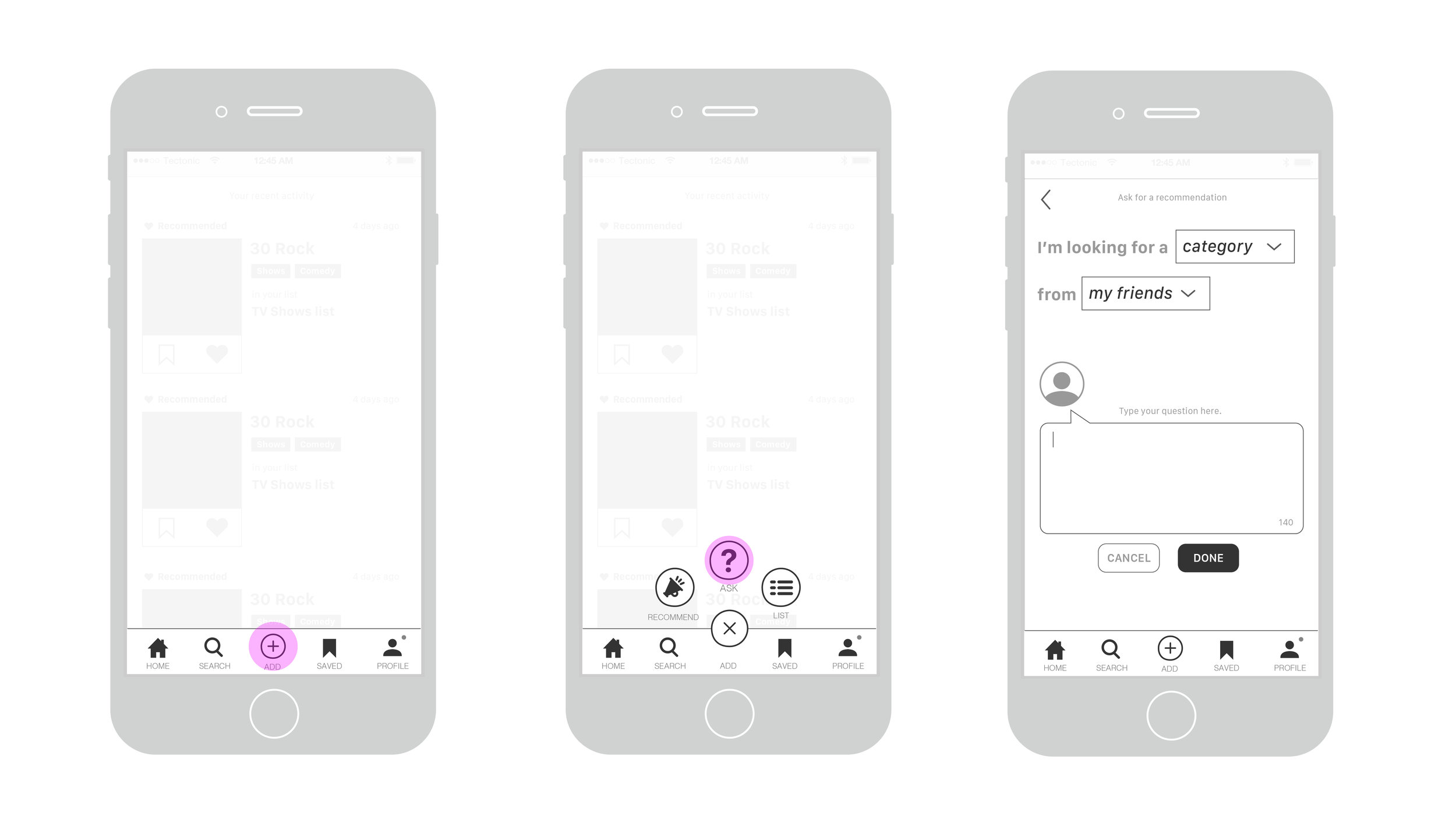
“Ask” Functionality
Based on the user feedback, I believed the most important missing function was the ability to ask for recommendations. Without a prompt like a question, users didn’t feel the need to input their preferences or expertise into the system. While “ask” is now the first thing a user comes across when they open the app, it was a contentious debate that required visualizing through wireframes and testing with users to get approval.
After

My Contribution
The product and UX continued to evolve after handoff in December of 2017. The navigation bar went through several more iterations based on user testing until reverting closely back to our “Instagram” model. Overall my biggest contribution was fending off feature creep and translating user feedback into the “20/80:” the 20% of features customers use 80% of the time. Much of the app still resembles the ideas first laid out in our initial strategy one-sheet.
Release
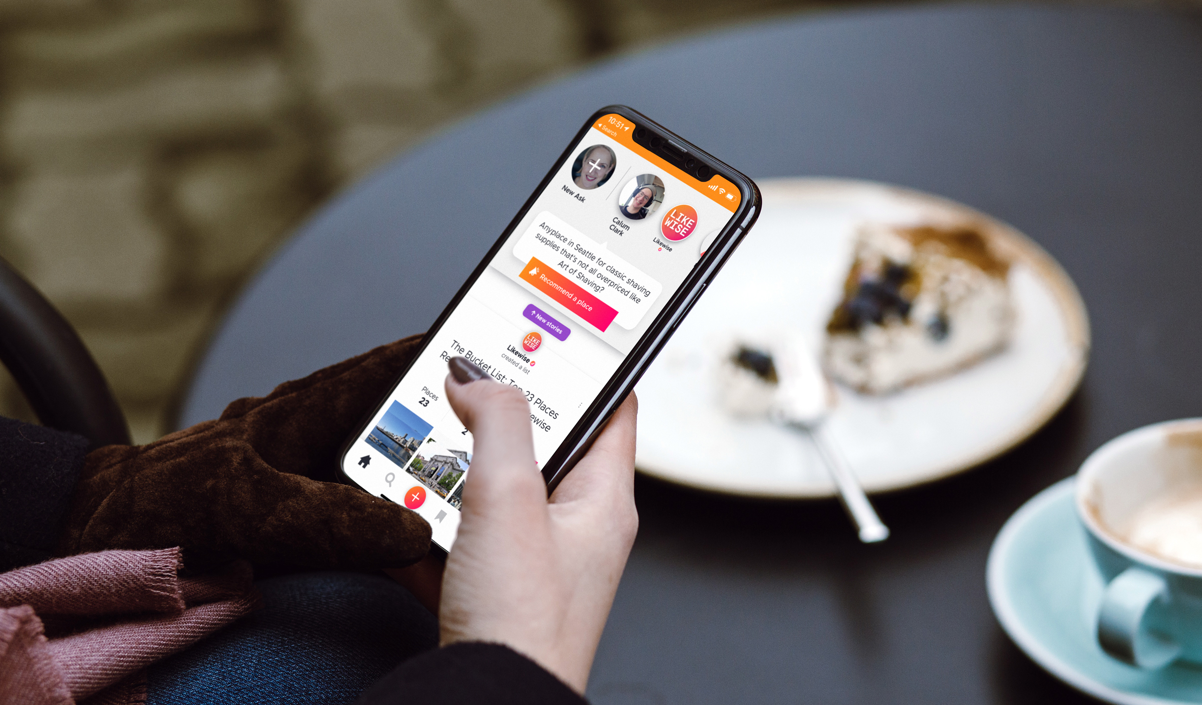
Bill Gates announced the public release of Likewise in 2018.
Download the app


Final thoughts
On the Tectonic side, a large portion of this effort was also executed by Lauren Javor, a UX designer who tirelessly fights for what’s best for the user, and Ronald Viernes, an infinitely talented visual designer. Bill Flora, Tectonic’s founder and the Executive Creative Director for this project, taught me most of what I know about leading design workshops and getting disparate teams on the same page. The Likewise team is growing and employs a talented group of designers who continue to make this a great product.
Unfortunately much of my work as a consultant can’t be shown to the public but if you’d like to hear more, give me a shout and I’ll take you out for coffee.